


Sometimes stock market rallies can be so powerful that you just have to grab ahold of something sturdy and hang on. Every once in a while, the upward surge can be so strong that it feels as though it’s fake – too much wealth being created in too short a time, inevitably destined to evaporate.
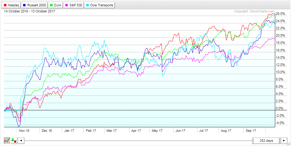
The last 12 months have felt that way. With the major averages up anywhere from 19-26%, many investors are logging in to see account balances that have never been this high.
A recent analysis by FactSet adds a unique perspective to this recent surge. According to them, since February 2016, the market-cap of global shares has risen by an amount roughly equal to the entire value of world stocks in March 2009.
That’s sort of crazy if you think about it. In the span of roughly 20 months, as much wealth was created in global equities as existed around the world in 2009. Whoa.
Too much too fast? It’s possible.
Don't miss Krinsky: We're Seeing a Global Market Breakout
During times like these, investors tend to bifurcate into two different camps. Some (the majority), see gains like this and can’t hold back feelings of greed and the fear of missing out. Even if they’ve participated in the rally to some extent, they want more and tend to chase the market higher.
The other camp shies away from rallies like this, seeing them as illogical and irrational. They have a habit of fading these rallies (selling positions) in hopes the market will correct downward, as it often does, allowing them to get back in at better prices.
These are both natural reactions to large primary trend moves, and one is not necessarily any more right than the other. The determining factor, of course, is how much further the market rises before the inevitable end to the rally occurs. Sometimes these big melt-ups occur mid-cycle, and other times they mark the final blow-off top that transitions us into a bear market.
So which are we dealing with now? It would appear the former.
While certainty is a prized commodity in forecasting that can never quite be achieved, many signs currently point to a synchronized global recovery. Let’s go through some of those indicators now.
To begin, it helps to have a snapshot of where things currently stand. In the table below, courtesy of Trading Economics, we can see that all the major economies are currently in expansion mode (look at the GDP YoY column).

This is important, as it hints at the existence of a virtuous cycle. Because our economies are intimately connected, improvement in one area tends to beget improvement elsewhere, and so forth. We saw the exact opposite of this happen when the US subprime mortgage crisis brought the US economy to its knees, which, in turn, triggered a global recession (a vicious cycle).
The fact that all major global economies are expanding in sync points to the existence of a significant amount of economic inertia, which is hard to reverse. But financial markets don’t care how things stand currently; they care about expectations moving forward. So how do those look?
One place we can go for an indication of this is The Conference Board’s Leading Economic Indexes. In the table below we can see that the vast majority of developed economies are showing increases in their respective leading indicators. This suggests that not only are conditions pretty good, they’re improving.

Halfway down this table you’ll notice that the “Global” leading economic index is also rising. I’m sure you could probably figure that out from the various countries’ figures, but it’s nice of The Conference Board to specifically point that out for us.
To be honest, I feel like I could stop here, as this table contains an immense amount of predictive information, but let’s look at some other cues.
Two places investors have commonly sought out indications of global growth are the movement in commodities, with a particular emphasis on items such as copper, and shipping indexes, such as the Baltic Dry Index. Let’s review both of these.
First up is Dr. Copper.
As you can see below, copper has been rising steadily over the past year, and as of yesterday, reached a three-year high on the back of strong Chinese demand.

Some analysts are attributing the rise in copper primarily to speculative buying, and that could be the case, but there is evidence for strong global growth to be found elsewhere.
The Baltic Dry Index is a shipping and trade index which measures the cost to transport various raw materials around the globe. Its chart is shown below.
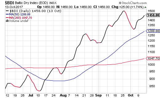
Rising shipping costs reflect increasing demand to ship goods. Similar to how we view the Dow Transports as a gauge of whether products in the US economy are being moved to consumers, the Baltic Dry Index can be used as a proxy for the demand to get products (primarily raw materials to be used in further production) shipped around the globe.
The rise here is a very healthy development and shows that companies are having to outbid one another to get space aboard shipping vessels.
Okay, now let’s shift gears a bit and look at global PMIs. We often look at PMIs (Purchasing Managers’ Index) for the US as a leading indicator, but these figures are also compiled for countries around the world.
In the chart below, which is courtesy of J.P. Morgan, we can see the trend in global PMIs over the last couple of years.
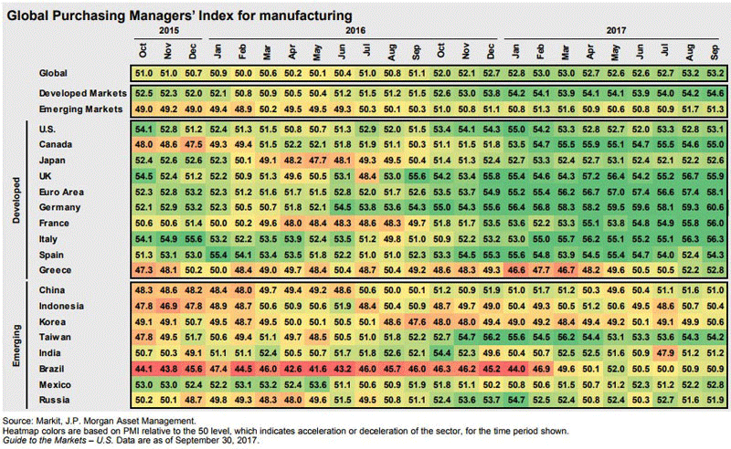
The color coding in this chart is phenomenal and allows us to visualize the broader trend without having to look at individual figures. In the chart, the heat map colors are based on PMI relative to the 50 level, which indicates neither expansion or contraction. Reddish colors represent deceleration in manufacturing, while green highlights acceleration.
If you let your eyes glaze over a bit, you’ll notice a darkening in the shades of green as this table, progresses from left to right. What this signals is a global pickup in manufacturing, which one would naturally equate to a pickup in growth. So based on this table, manufacturing activity at the global level is accelerating quite strongly.
You may also like Extreme Greed! CNN Fear & Greed Index at New Multi-Year Highs
Okay, now let’s pivot again and look at the trend in inflation by country. Inflation is synonymous with growth in many ways, so what we’d like to see here is a global trend toward higher levels of inflation.
And in the chart below, again courtesy of J.P. Morgan, this is exactly what we see.

This time, the heat map colors are based on z scores, which are basically a representation of where current inflation levels sit relative to their five-year history. Blue colors represent inflation that is at the lower end of the 5-year spectrum, while red colors show inflation near the high end of that spectrum.
The transition from blue to red (as we move left to right in the table) for developed economies should be very apparent. This means that inflation pressures are building, and it helps validate some of the behavior we are seeing by central banks as they begin, or at least discuss, paring back stimulus.
All of this data suggests that global growth remains on solid footing and that global equity markets are likely to continue working their way higher. The corresponding investment protocol, then, is to maintain exposure while making sure not to get caught up in the euphoria that often accompanies these types of moves.
It’s a global bull market, and while we must not get complacent, we should enjoy it. After all, we’ve been waiting a long time for this.
Before wrapping things up I want to show a few more charts that are not directly related to our discussion above but still harbor important takeaways. These charts are all courtesy of J.P. Morgan as well.
This first chart provides us with a glimpse into the economic (not market) gains following previous expansion peaks. There is a very interesting pattern here … can you spot it?
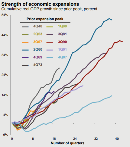
While it may appear that this most recent expansion (light blue line) is an outlier, showing significantly less growth than previous expansions, there is a larger trend at play here. If you take the time to look at each of the colors, you’ll notice that the further back in time we go, the steeper the lines get. More recent expansions have a more shallow slope.
What’s causing this? Easy, it’s a byproduct of compound growth.
The bigger an economy gets, the slower the growth rate it will be able to achieve. As our economy gets larger and larger, it simply can’t amass the same amount of growth on a percentage basis as it could when it was small. So I caution you … do NOT view the light blue line in this chart as an outlier; future recoveries will continue to be less and less spectacular on a percentage basis. As I’ve been saying for years, it’s time to get used to slower economic growth ... and recoveries.
Moving on, these last charts are just to once again highlight the status of the American consumer. I won’t spend much time here because the takeaways are evident: household net worth is at an all-time high, and household debt service payments are at their lowest ratio in over three decades.

The preceding content was an excerpt from Dow Theory Letters. To receive their daily updates and research, click here to subscribe. Matt is also the Chief Investment Strategist at Model Investing. For more information about algorithmic based portfolio management, click here.


