


Originally posted at Danielamerman.com.
Two important financial cycles are currently converging for the first time in more than ten years, and how they work in combination can provide key information about the future value of our retirement portfolios, the future prices of our homes, and even when the next recession may hit.
A continuing cycle of interest rate increases by the Federal Reserve has pushed Fed Funds rates up two percent from their floor. This same cycle has contributed to rapidly rising long-term interest rates, with 10 year Treasury yields rising to 3.22 percent by the market close on October 5th, 2018.
This sharp surge in interest rates has led not only to falling bond prices, but to tumbling stock prices as well.
Until recently however, an offsetting cycle has been at least partially shielding the value of many assets - including home values and REIT values - from the Fed's increasing interest rate cycle. There has been a "shock absorber" in place, as shown in the blue area below.

The compression of the yield curve (the difference between short term and long-term interest rates) is an offsetting cycle, which historically shields consumers and markets from the full effects of the Fed increasing short term interest rates - until it doesn't. There used to be a large shock absorber in place, as identified with the red letters "A" and "B" above, but as can be seen with the letter "C"- that shock absorber has been almost entirely used up.
There used to be a great deal of room between short term interest rates and long-term interest rates. The markets could absorb much or most of the negative impact of the Fed's ongoing short-term rate increases, and not pass through the full effects to long term bond yields or mortgage rates.
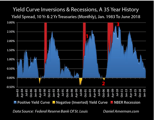
There is, however, a particular problem with using up the rest of the very thin shock absorber that remains. That part of the cycle has indeed occurred several times before, and the result each time has been the golden areas of "yield curve inversions" above, when short term interest rates become higher than long term interest rates.
These quite uncommon cyclical inversions have then (with remarkable consistency) been followed shortly thereafter by the red areas of recessions. (An in-depth analysis of the historical relationship between yield curve inversions and recessions is linked here.)
This leaves the markets - and homeowners - between "a rock and a hard place". Assuming the Fed continues to increase interest rates, then either:
- The shock absorber stops absorbing the damage, and further anticipated Fed rate increases go full force from here forward into reducing not only bond prices, but also possibly stock prices and home values as well; or
- The shock absorber uses up the last of its power, there is a yield curve inversion, and history shows there is then a very high chance that a recession will occur in the next one to two years.
This analysis is part of a series of related analyses, an overview of the rest of the series is linked here.
Changes in Yield Curve Spreads
The graph below shows three interest rates on a weekly basis between October of 2013 and early October of 2018, with effective Fed Funds rates shown on bottom in yellow, two year Treasury yields in red, and 10 year Treasury yields on top in green. In the markets, typically, long term interest rates are higher than short term interest rates. For each week shown, 10 year yields are indeed higher than two year yields, which are in turn higher than the overnight Fed Funds interest rates.
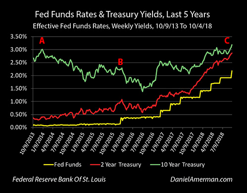
There was a great deal of room between long-term and short-term interest rates during the years the Federal Reserve followed its unprecedented policy of near zero interest rates. Looking at point "A", 10 year yields were 3.01 percent during the first week of January 2014 and two year yields were a mere 0.39 percent, so there was a wide yield curve spread of 2.62 percent.
Point "B" marks the tentative and slow beginning of the Fed's current cycle of increasing interest rates that began at the end of 2015. As can be seen on the red and green lines above, neither markets nor consumers really paid the price. The red line of two year yields fell, as did the green line of 10 year yields.
Instead of the Fed's first 0.25 percent interest rate increase leading to higher long term bond rates (and mortgage rates), long term yields fell by 0.50 percent over the next two months, from 2.25 percent to 1.75 percent, with 0.28 percent covered by using up part of the wide yield curve shock absorber, and the rest coming from decreases in the two year yield.
By the time we reached point "C" in 2018, most of the forgiving and wide shock absorber was gone.
The First Two 0.25 Percent Increases in 2018 Wipe Out The Safety Margin
In 2018, during the week ending February 16, the 10 year Treasury yield was 2.87 percent, and by late March the Federal Reserve raised short term interest rates by 0.25 percent. Yet, by the week ending April 20, the 10 year Treasury yield was 2.88 percent, so there was almost no penalty from the Fed increase for long term yields, bond prices, or mortgage rates.
How did that happen? The yield curve spread compressed from 0.72 percent to 0.46 percent, using up 0.26 percent of what little remained of the shock absorber.
In the week ending June 1, the 10 year Treasury yield was 2.8 percent, and in late June the Federal Reserve increased the targeted Fed Funds rate range by 0.25 percent. By the week ending July 20, the 10 year Treasury yield was very close to where it had been, at 2.8 percent.
Long term interest rates, bond prices, and housing values were safeguarded from the Fed's rate increases. Once again, the source of the protection was using what remained of the shock absorber. The yield curve spread went from 0.43 percent to 0.26 percent, which absorbed 0.17 percent of the 0.25 percent rate increase. (Most of the remainder came from the change in the spread between Fed Funds and two year Treasury yields.)
While effective, this shock absorption took the cycles to a critical place - the remaining shock absorber was now barely more than one of the 0.25 percent Fed Funds rate increase - and multiple future Fed Funds rate increases were (and are expected). So either the yield curve had to invert - or the protection had to be lost, and the truly rough ride for the markets had to begin.
The Third 0.25 Percent Rate Increase & The Coming Cyclical Implications
In late September, the Federal Reserve did indeed increase the target Fed Funds rate range by 0.25 percent. The yield curve did not invert. Instead, the yield curve spread between the two and 10 year Treasuries was 0.32 percent for the week ending October 4, which was almost identical to the 0.31 percent spread for the week ending August 3, before the rate increase.
Because the thin remaining shock absorber was not used up - the 10 year Treasury bond had to take the full yield increase right on the chin. It rose from 2.97 percent the week of August 3, to 3.19 percent the week of October 4, which was an increase of 0.22 percent, or an almost identical amount to the increase in Fed Funds rates.
The headlines screamed, bond markets tumbled, stock markets took a hit, and so did the emerging markets on a global basis.
(Markets are messy things when it comes to weekly yield and spread fluctuations in basis point terms. The date pairs above were selected as tangible and accurate representations of what was indeed the big picture, as the market moved from a yield curve spread equal to about three 0.25 percent Fed Funds rate changes in February before the first increase of March, down to about one Fed Fund rate change in July after the second increase, with the third Fed Funds increase of September going straight into the 10 year Treasury yields instead of being absorbed by the yield curve.)
Shocking as it was for many investors, this day had been coming for a very long time.
We have a significant history of the Federal Reserve cyclically increasing and decreasing interest rates, as part of the pattern of economic expansions and recessions. While less understood by most people, we also have a long history of offsetting cyclical changes in yield curve spreads. Including major increases in spreads as the Fed goes through cycles of decreasing rates, and major decreases in yield curve spreads as the Fed goes through cycles of increasing rates.
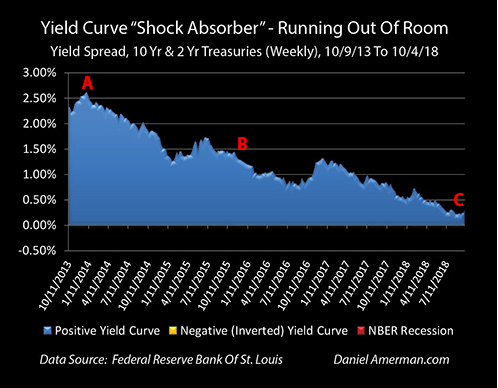
Little noticed by many in the markets - the shock absorber has been disappearing in plain sight for quite a while now as part of this current cycle, as it has in many cycles before this one. Given the limited amount of yield curve spread to work with, there was always a limit as to how many short-term rate increases could be absorbed. The convergence as seen in point "C" above is indeed once again upon us, and the yield curve could indeed invert once more.
Or, we could go the other direction, and yield curve spreads could remain steady - or even increase - even while the Federal Reserve continues to increase interest rates. And if that happens - much of the market complacency that has developed in recent years could go right out the window.
A prolonged cycle of fast, increasing long term interest rates without buffers is something the markets have not seen for a very long time. There are currently many market professionals who have never seen such a cycle during their careers.
The math is fairly simple. The shock absorber is effectively gone. The Fed can stop increasing interest rates. Or the yield curve can invert and go negative. Or the markets can begin a likely wilder ride than what has been seen since before the Great Recession, as bond investors, stock investors, international investors, and real estate investors (as well as homeowners), all experience the full force of what happens when fast rising long term rates hit markets that have collectively forgotten about the possibility that such a thing can happen.
(This is a relatively short analysis of recent market changes, and it is therefore quite limited in what can be covered. There are far more in-depth analytical resources available on my website, which go into much more detail on what has necessarily been left out here.)
The Cycles & The Bigger Picture Over The Longer Term
The two cycles discussed can be dominant influences in a number of the markets over time, including the bond and stock markets, as well as the currency markets. These cyclical factors can also be a major determinant of real estate prices, and this has been particularly the case over the last 20 years or so.
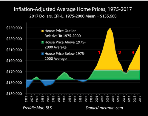
As seen in the graph above, the patterns of inflation-adjusted housing price changes have radically altered. Home prices used to be very stable in inflation-adjusted terms and fluctuated up and down in a range that was within about +/- 10 percent of average, as can be seen on the left side of the graph.
Since 2000, though, real estate prices have been almost continually outside the historic range, with the two "golden spikes" of outlier home prices that are entirely outside historical norms. There have been far greater home price gains - and home price losses - than had previously been experienced.
As explored in depth in the Five Graphs analysis series linked here, there is a strong linkage between the golden outlier 1-2-3 cycles of the changes in the home prices graph above, and the first cycle reviewed in this analysis, that of Federal Reserve policies and 1-2-3 cycle of Fed Funds rate changes as shown in the graph below.
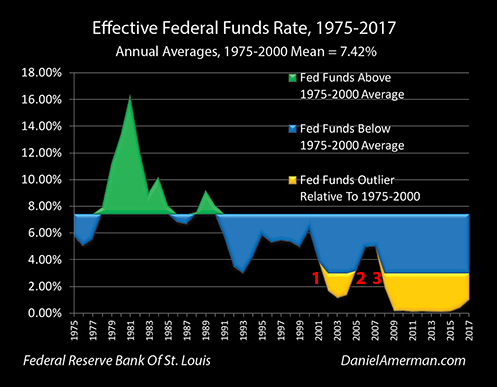
The golden areas are again historic outliers relative to the 1975 to 2000 period, and there are inverse "golden spikes" in Fed Funds rates in a 1-2-3 cycle that are closely related to the 1-2-3 cycles in housing prices.

The second cycle examined herein was that of recent changes in the 1-2-3 cycle of yield curve spread changes - and it is a critical factor in understanding both the "1" & "3" spikes upwards in home prices, as well as the "2" spike downwards. Indeed, when those two cycles are combined, and we go on to changes in mortgage rates, and then to the changes in mortgage payments, we can find a remarkable and logical correlation with real estate price changes that would otherwise seem to be violating historical norms.
It is also worth noting that the historical answer for current fork in the road has sometimes been "c) both of the above." Long term rates continue to quickly rise - but not quite as quickly as short term rates. The yield curve does invert. And recession does ultimately follow. That is not necessarily the path this time around, but there is a good chance that we are on the cusp of this happening again, unless there are some changes.
So for people who are interested in home prices or investments such as REITS, there is a strong case for closely watching the subject of this analysis, which is the ongoing combined developments in the Fed Funds cycle and the yield curve spreads cycle. Indeed, we are currently at a critical place that the housing market has not seen for 12 years. What happens next with the yield curve could have a drastic impact on real estate values over the next few years, as well as other markets.
The recent sharp increases in long term bond yields, and the uncanny track record of yield curve inversions in predicting recessions, have each been hot financial topics over the last few months. These are not always separate topics, however, but can be closely interrelated - as they are today - and the implications of that interrelationship could be crucial for the markets in the coming months and years.


