


Update: Given the market's slight breakdown this month, two of the three technical red flags for a possible top in the market have been raised. See updated chart and commentary below...
It is said that an image is worth a thousand words. This chart presents a possible roadmap for monitoring the risk of a major peak and bear market by comparing the technical similarities between the prior two market tops and where we are today (click image to enlarge).
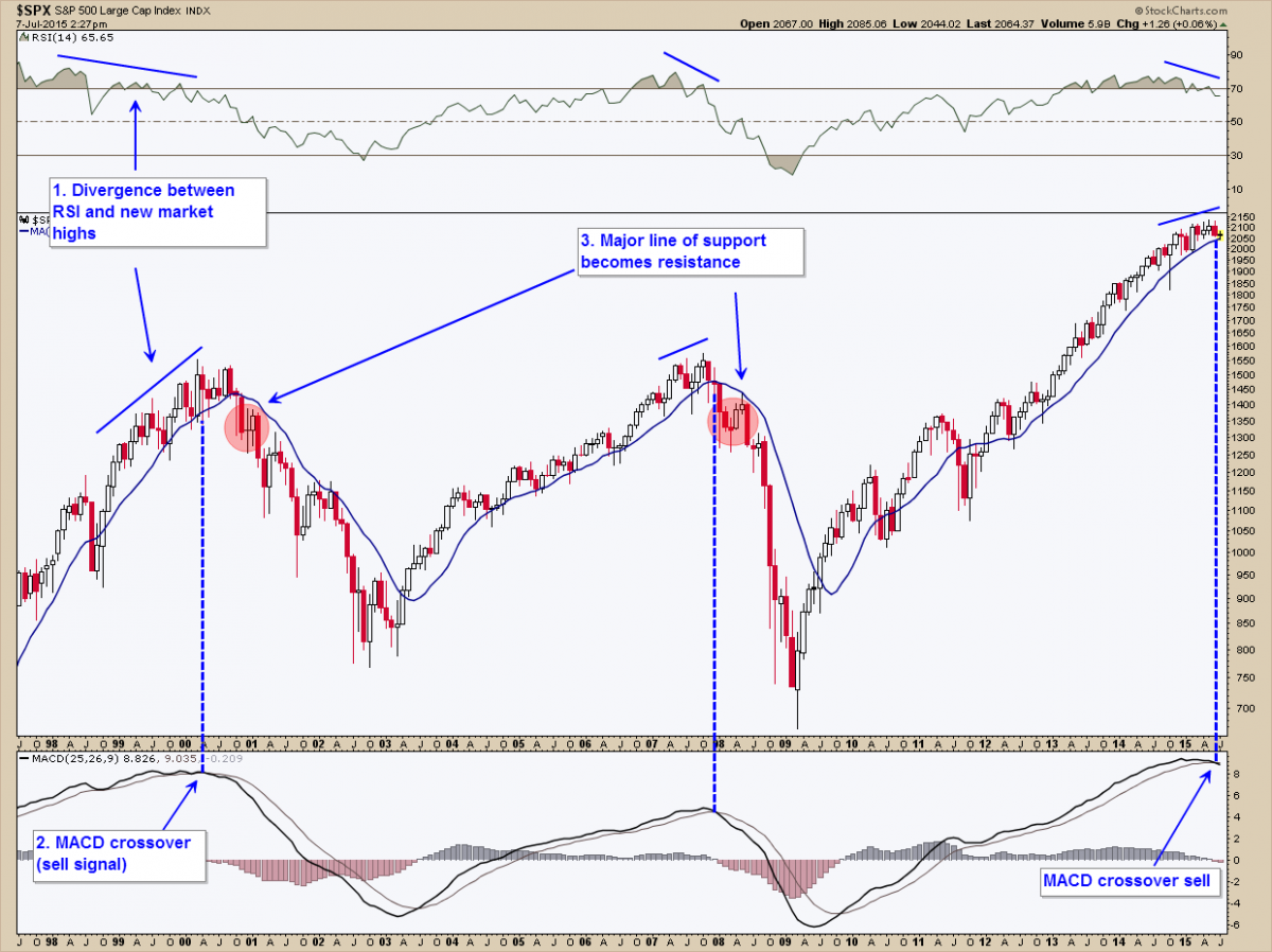
Red Flag Number One (√)
The first technical warning sign indicated in the chart above is a significant divergence between the relative strength index (RSI) and the market itself, as we see today. This is noted by a declining pattern of lower highs in the RSI as stocks continue to make higher highs, a sign that the market is “topping out”. In the late ‘90s this divergence persisted for many years as the tech bubble reached ever-higher valuation levels. In 2007 this divergence lasted over a much shorter period (6 months) before the market finally peaked and succumbed to massive selling.
Since this divergence can persist for months or years, we also look to two other technical red flags for possible signs of a market peak and impending bear market.
Red Flag Number Two (√)
The second technical sign to look for is a major crossover in the MACD (moving average convergence-divergence) indicator shown in the bottom panel. This is often used by technical analysts as a buy and sell signal. As shown by the dotted lines, a MACD sell signal occurred near both prior market tops in May of 2000 and December of 2007. We now see the MACD buy signal issued in 2009 has crossed over to a sell, indicating the possibility of a major market top.
Important note: though I have smoothed this indicator to eliminate any prior buy and sell signals that didn't correspond to major market turning points, as you'll often hear, "past performance is not indicative of future results." Since we must be alert to the possibility of a false sell signal at the current time, we look to an additional red flag for further confirmation.
Red Flag Number Three
When a major line of support becomes resistance, you now have confirmation of a possible trend change in the market. This occurred around January-February of 2001 and May-June of 2008 (see red circled regions on the chart) when the S&P 500 failed to break back above its 12-month moving average. After that point in time, the market persisted in a bearish downtrend until a confirmed change of direction with a new bull market. Currently, the S&P 500 is trading just above the 12-month moving average and has yet to break down further. If it does and fails, our third red flag will be raised.
Important Caveat
As we all know, history does not repeat itself, but it does rhyme. Even if the same technical pattern plays out again (i.e., all three red flags come to fruition), no one can predict the exact magnitude (depth) or duration (length) of a subsequent market decline, should one occur, since no two tops or bear markets are alike. The most prudent investment strategy is to monitor market action, incoming data, and make corresponding adjustments as the situation requires. The chart presented is one of many tools for doing just that. For additional reading, I highly recommend Chris Puplava's regular updates on financial stress levels, leading economic indicators, and the credit markets found here.


